
Branding & Visual Identity | herbic
Create a more outstanding brand identity for a Berlin-based ice cream brand crafted for adults in late night.

Overview
herbic set out to reposition ice cream as a refined, alcohol-free indulgence for adults — replacing overt sweetness with licorice and herb-infused flavors designed for a bar setting rather than a typical ice cream shop.
The core idea was to capture "our valuable time": small, shared moments worth slowing down for. This translated into a logo built on dual meaning — two figures in a warm embrace that also read as two scoops of ice cream resting on a herb leaf — linking the brand's emotional core directly to its product.
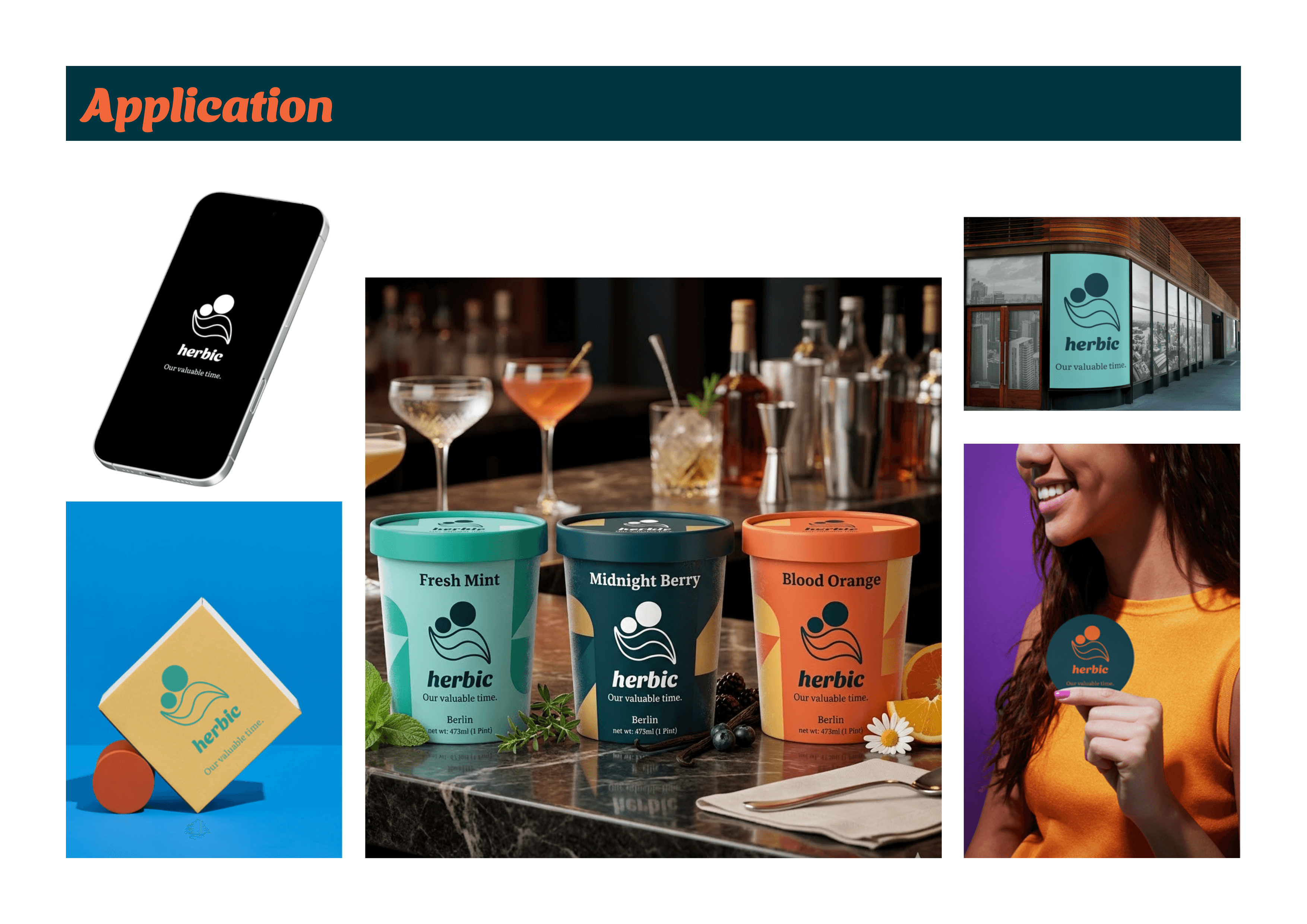
The result is a simple, adaptable identity that carries both sophistication and warmth across packaging and brand touchpoints.


Find more relevant works…